

Data Analytics Portfolio: 4 Projects That Get You Hired in India 2026
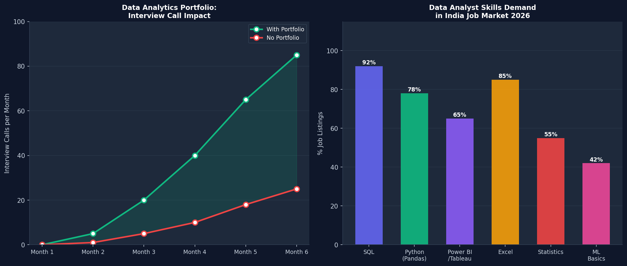
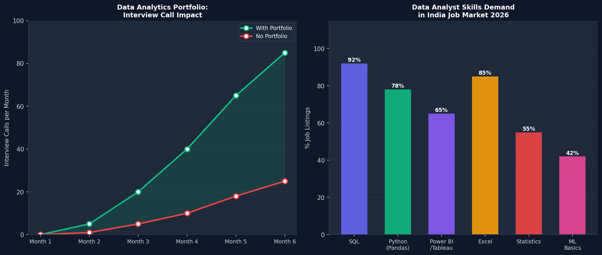
A data analytics portfolio is what separates candidates who get interviews from those who do not in India in 2026. Data analysts with 4 well-documented portfolio projects on GitHub or Tableau Public get 3-5x more recruiter responses than those with only certifications, and they negotiate Rs1-3 LPA higher starting salary because they can show exactly what they built. This guide gives you the 4 most impressive projects to build — with specific datasets, tools, and what to include.
Project 1: Sales Dashboard in Power BI or Tableau
Every data analyst interview starts with “show me a dashboard you built.” Use a free public dataset and build this one first.
Dataset to use:
Superstore Sales dataset (available on Kaggle free) — 10,000 rows of retail sales data with product, region, customer, and profit columns.
What to build (Power BI or Tableau):
- KPI cards: Total Revenue, Total Orders, Profit Margin, Average Order Value
- Line chart: Monthly revenue trend with year-over-year comparison
- Bar chart: Sales by Category and Sub-Category
- Map: Sales by State (India or US Superstore dataset)
- Filters: Date range, Category, Region — all interactive
- Drill-down: Click a category to see sub-category breakdown
What makes it stand out:
- Write a 1-paragraph “Business Insight” on the dashboard: what did you find?
- Use consistent color palette (not default chart colors)
- Include a date filter that actually affects all charts
- Publish to Tableau Public or Power BI Service with a shareable link
Project 2: SQL Customer Analysis (GitHub)
SQL is in 92% of India DA job listings. A SQL project on GitHub proves you can query real databases.
Dataset: E-commerce Orders (PostgreSQL or SQLite)
Download the Brazilian E-Commerce dataset from Kaggle (100K orders, free). Set up locally with SQLite or use Google Colab with SQLite.
Queries to write and document:
-- Customer Lifetime Value by cohort
SELECT
    DATE_TRUNC('month', first_order_date) as cohort_month,
    COUNT(DISTINCT customer_id) as customers,
    SUM(revenue) / COUNT(DISTINCT customer_id) as avg_ltv
FROM (
    SELECT
        customer_id,
        MIN(order_date) OVER (PARTITION BY customer_id) as first_order_date,
        SUM(order_value) OVER (PARTITION BY customer_id) as revenue
    FROM orders
) customer_summary
GROUP BY cohort_month
ORDER BY cohort_month;

-- Month-over-month revenue growth
SELECT
    order_month,
    monthly_revenue,
    LAG(monthly_revenue) OVER (ORDER BY order_month) as prev_month,
    ROUND(
        (monthly_revenue - LAG(monthly_revenue) OVER (ORDER BY order_month)) * 100.0
        / LAG(monthly_revenue) OVER (ORDER BY order_month), 2
    ) as mom_growth_pct
FROM (
    SELECT
        DATE_TRUNC('month', order_date) as order_month,
        SUM(order_value) as monthly_revenue
    FROM orders
    GROUP BY order_month
) monthly;
README must include:
- Business questions you answered
- Key findings (bullet points)
- Screenshot of query results
- Instructions to run locally
Project 3: Python EDA — Customer Churn Analysis
EDA (Exploratory Data Analysis) with Python is the most common technical task in DA interviews. Build this project to demonstrate it.
Dataset: Telco Customer Churn (Kaggle, 7K rows, free)
Goal: Analyze which customers are likely to cancel the service and why.
import pandas as pd
import matplotlib.pyplot as plt
import seaborn as sns

df = pd.read_csv("WA_Fn-UseC_-Telco-Customer-Churn.csv")

# 1. Churn rate overview
churn_rate = df['Churn'].value_counts(normalize=True) * 100
print(f"Churn rate: {churn_rate['Yes']:.1f}%")

# 2. Churn by contract type
churn_by_contract = df.groupby('Contract')['Churn'].apply(
    lambda x: (x == 'Yes').mean() * 100
).round(1)

# 3. Average monthly charges - churned vs retained
print(df.groupby('Churn')['MonthlyCharges'].mean())

# 4. Visualization
fig, axes = plt.subplots(1, 2, figsize=(12, 5))
churn_by_contract.plot(kind='bar', ax=axes[0], color=['#10B981', '#EF4444', '#6366F1'])
axes[0].set_title('Churn Rate by Contract Type')
axes[0].set_ylabel('Churn Rate (%)')

sns.boxplot(data=df, x='Churn', y='MonthlyCharges', ax=axes[1],
            palette={'No': '#10B981', 'Yes': '#EF4444'})
axes[1].set_title('Monthly Charges: Churned vs Retained')

plt.tight_layout()
plt.savefig('churn_analysis.png', dpi=150)

# KEY INSIGHT IN NOTEBOOK:
# Month-to-month contract customers churn at 42% vs 11% for 1-year and 3% for 2-year
# High monthly charges (Rs70-100/month) correlate with 28% churn vs 15% for lower charges
Project 4: HR Analytics Dashboard (Python + Matplotlib Report)
HR analytics is one of the hottest DA domains in India — every mid-size to large company needs data analysts for their HR team.
Dataset: IBM HR Analytics (Kaggle, 1,470 employees, free)
Analysis to include:
- Attrition rate by department, role, and age group
- Salary band analysis: median salary by job level and education
- Satisfaction score distribution and correlation with attrition
- Overtime impact on attrition: do employees who work overtime leave more?
Present findings as a PDF report (use Matplotlib to generate multi-page PDF) — this shows business communication skills that dashboards alone do not.
Where to Host Your Portfolio
- GitHub: SQL queries, Python notebooks (Jupyter), EDA projects, README files
- Tableau Public: Interactive dashboards (free, sharable link)
- Power BI Service: Power BI dashboards (free tier, sharable)
- Kaggle Notebooks: Python EDA notebooks with version history and public profile
- LinkedIn: Post screenshots of your dashboards with business insights as posts — recruiters see this
Frequently Asked Questions
Do I need real company data for a data analytics portfolio?
No. Public datasets from Kaggle, government open data portals (data.gov.in), and World Bank are widely accepted and preferred — real company data creates privacy and NDA issues. Interviewers know you used public data and do not penalize for it. The quality of your analysis matters, not the data source.
How many portfolio projects do I need for a data analyst job in India?
Minimum 3 projects covering different tools: one dashboard (Power BI or Tableau), one SQL project, one Python EDA project. Adding a 4th project significantly increases your interview rate. More than 5 projects is not necessary — depth and quality over quantity.
Should I use Power BI or Tableau for my portfolio dashboard?
Power BI for most India job market targeting — Power BI has 22,000+ job postings vs Tableau’s 8,000+ in India. However, if targeting global MNCs or premium startups that pay higher, Tableau is stronger. Ideally build one in each. If forced to choose, Power BI first.
How do I present my data analytics portfolio in an interview?
Share your screen with the dashboard open before the interviewer asks to see it. Walk through: what the business problem was, what data you used, 2-3 key insights you found, and one business recommendation. Keep the walkthrough to 5 minutes. Have GitHub open in another tab for your Python project.
